


Fresh Prints & Creative Sparks
A look at my inspiration board

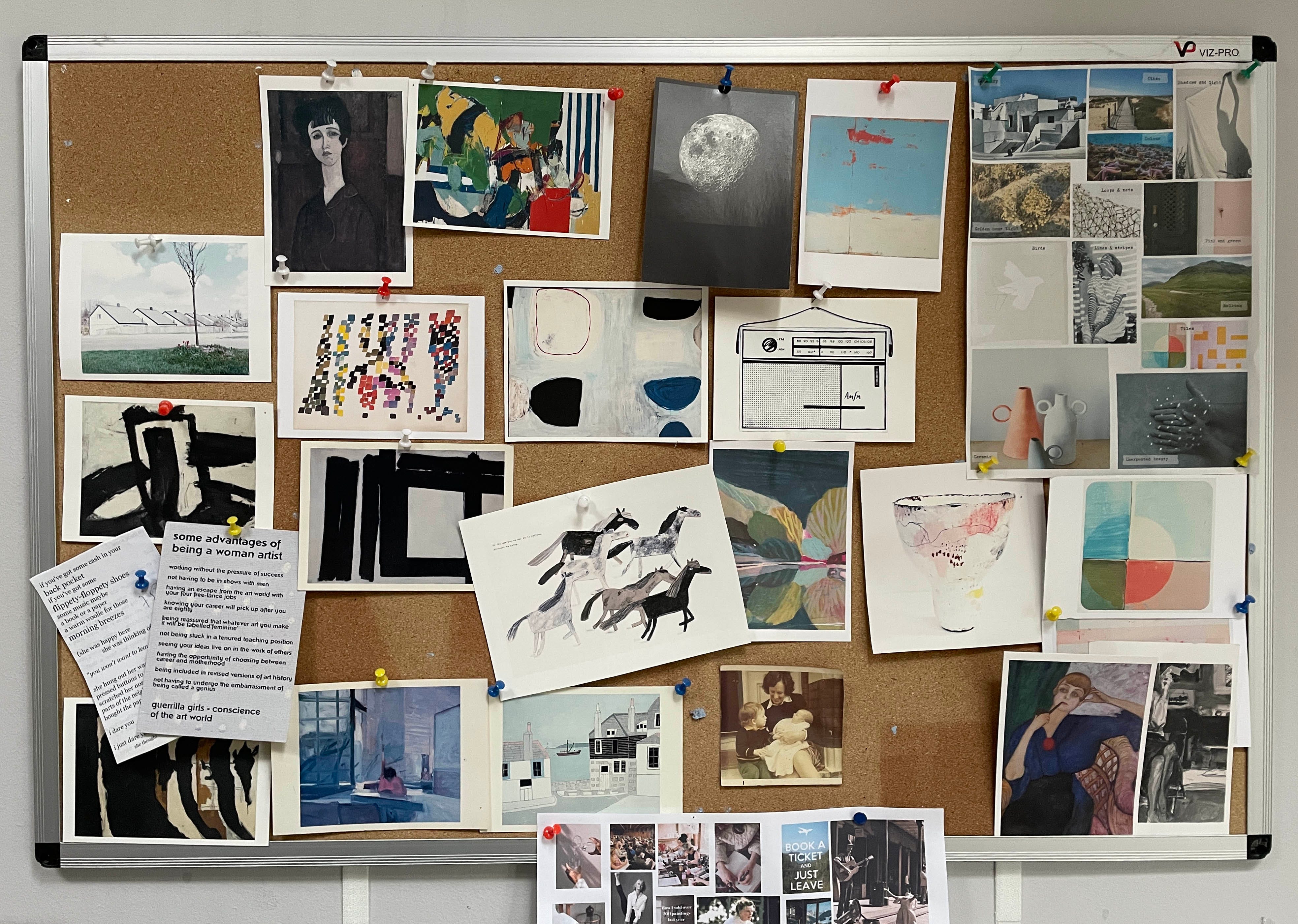
I wish I kept photos of this board as it changes. I don’t change it up often, just sometimes when something inspires me, or I have a new postcard from a show.
Whenever I look at this Bryan Pearce postcard, I realise it has inspired something in me, whether it’s the naive wobbly lines or the colour palette. Now I look at it closely I can see the pink so much clearer. I didn’t know it was there.
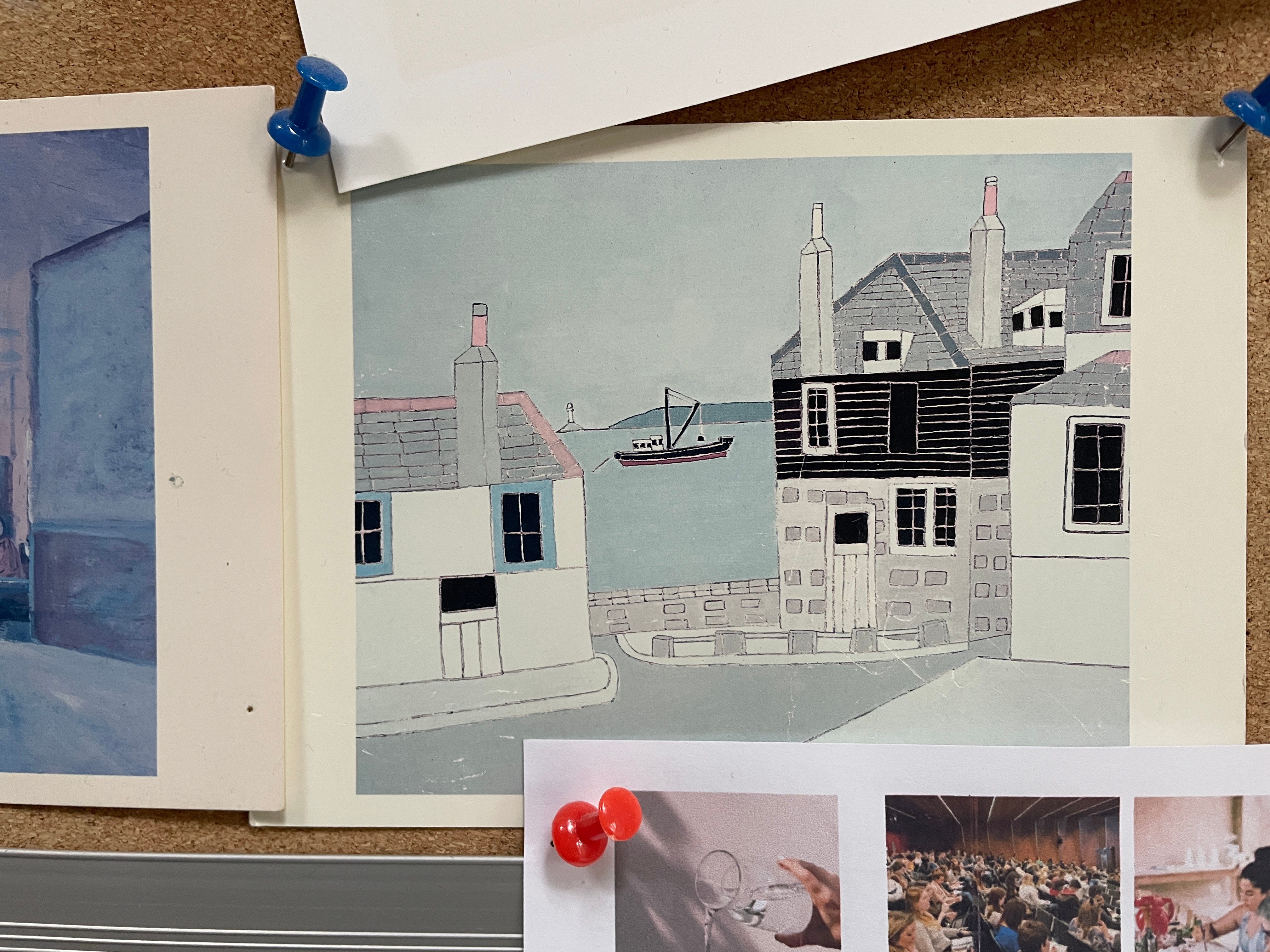
You can see it in a still life I’ve been working on recently - the dusky duck egg blue, creamy white and wobbly black line.

This one is still in progress, but I do have 3 new prints in the shop, ready for Spring, perfect for kitchen / dining spaces.

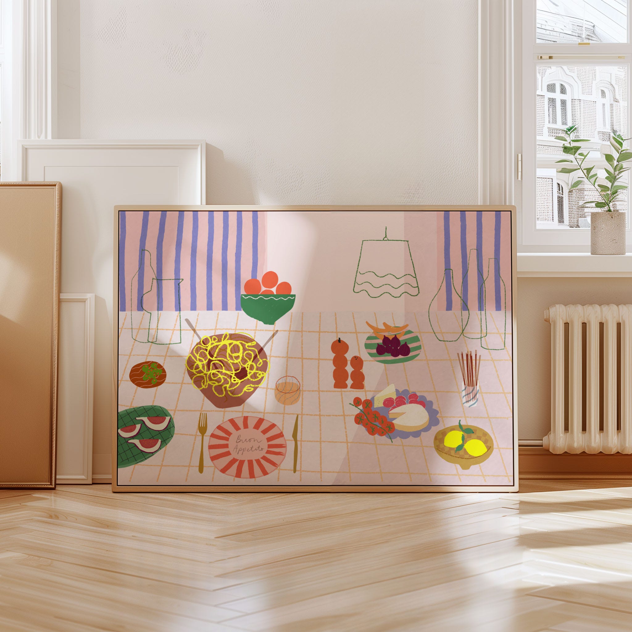
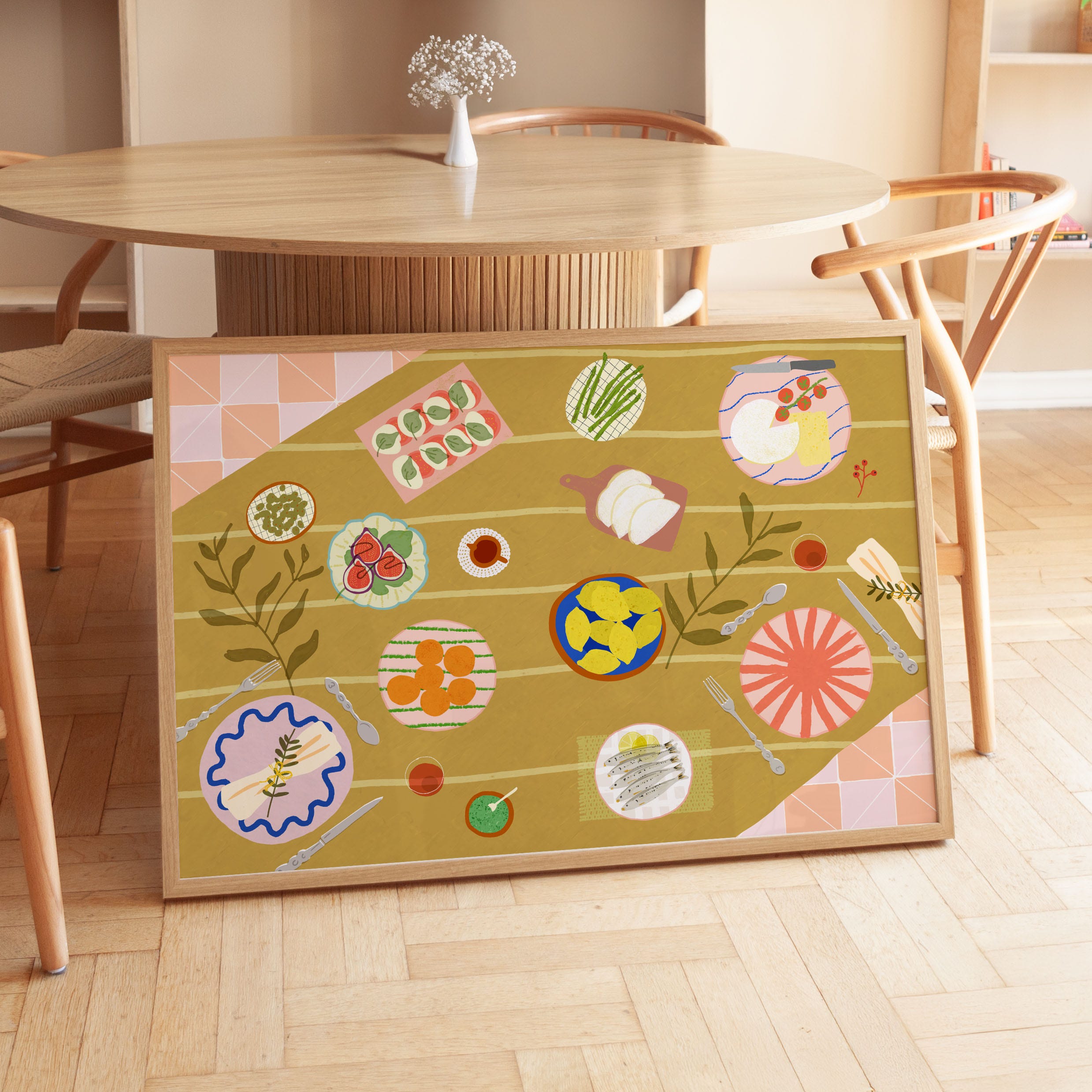
First up - Buon Appetito - evoking long lunches on the Amalfi coast. I've used lots of lovely shapes and patterns, and different techniques like scanned textures and line drawing. It has a late summer palette of roasted tomato, fig and lemon.
Simpatico has a bold graphic design juxtaposed with a soft palette and painterly texture, bringing pattern trends and classic design together with some 80s California thrown in. Mostly I was thinking about Maggie Smith in California Suite.
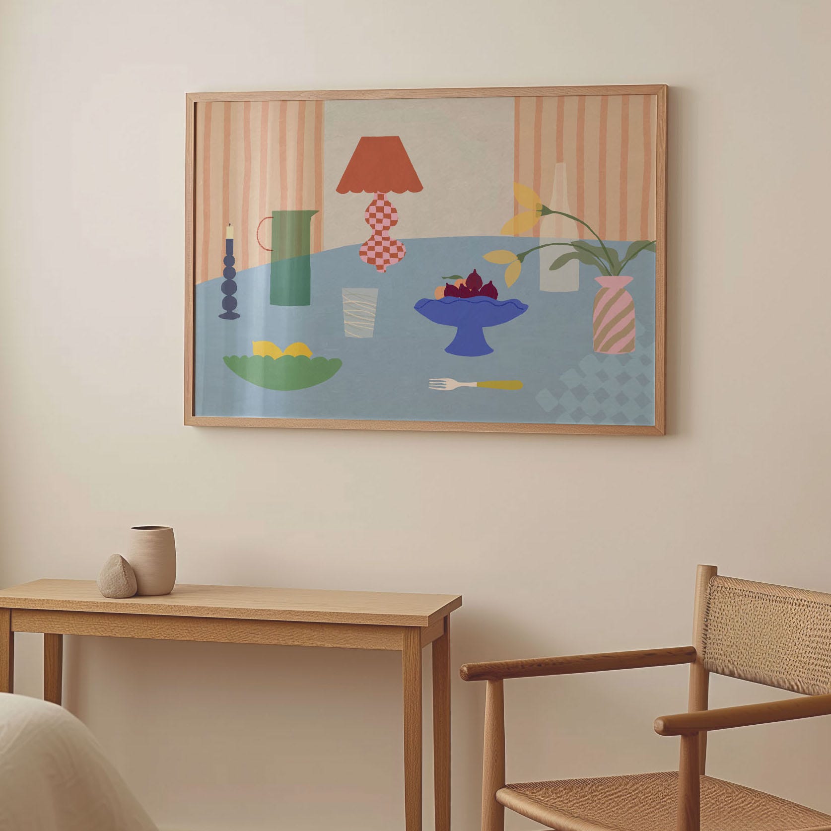
Pronto is a super colourful flatlay tablescape, drawing on the heritage aesthetic. An inviting warm palette and lots to explore.
Hope you like them! They’re available in a few different sizes, framed or unframed.
Here are some close ups of my board. What’s on yours I wonder? And do you notice things have seeped into your work subconsciously?


Thanks for reading!
I love a pin board, who made the picture of the horses please? I enjoyed looking for the pink, I didn’t see it at first